A client lands on your trip page. They’ve got a card in one hand and a calendar in the other. They’re ready. You have about ten seconds before they decide whether to keep reading or go back to the search results.
Most outfitter pages waste those ten seconds. Big pretty banner, the name of the outfit, maybe a mission statement about your love of the sport — and the one thing they came for buried four scrolls down past a bio nobody asked for.
A booking page isn’t a portfolio. It has one job: turn a ready client into a booked trip. Everything above the fold should be working toward that, and nothing else should be in the way.
What belongs above the fold
“Above the fold” just means what they see before they scroll. On a phone, that’s a small window. Treat it like prime real estate, because it is. Here’s what earns a spot:
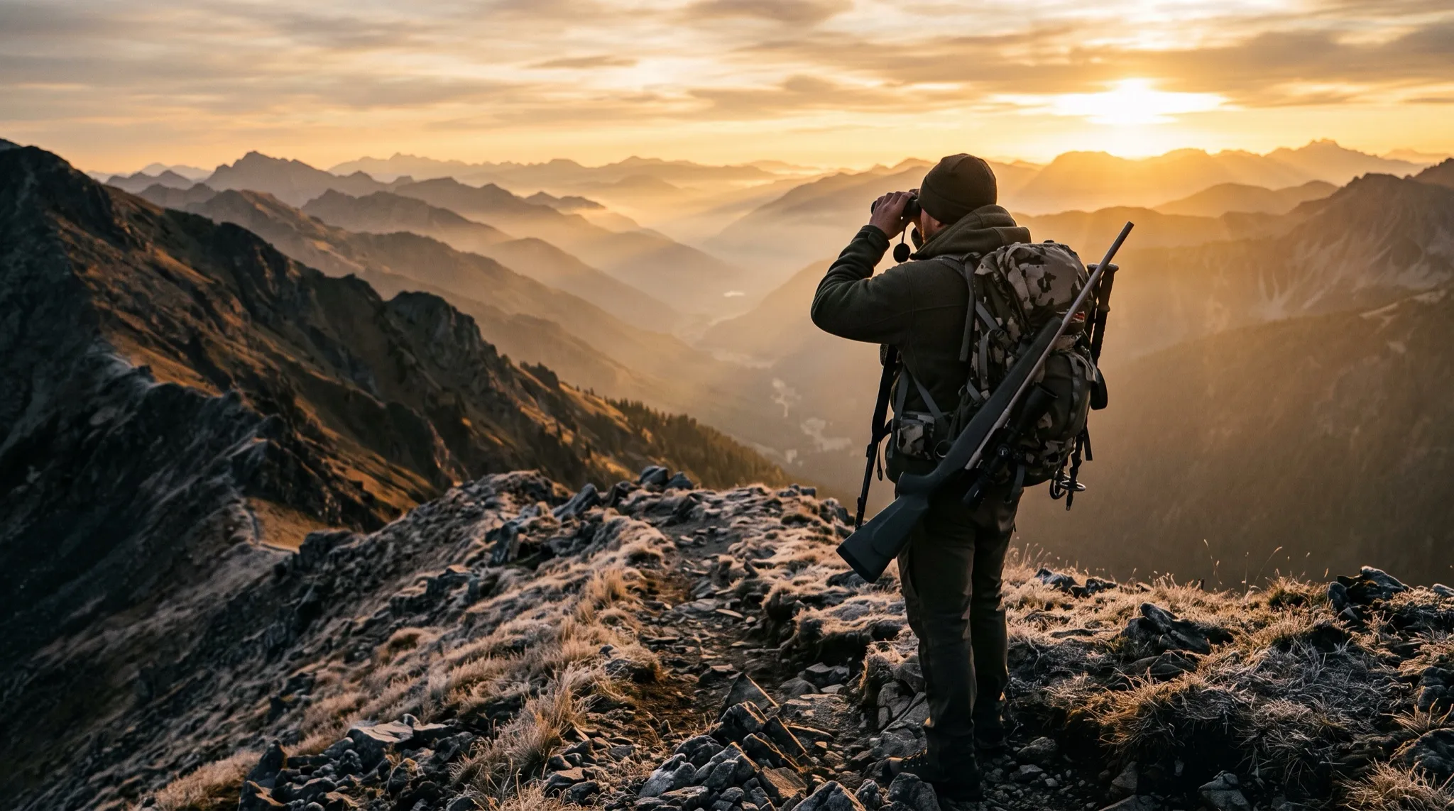
- One real hero shot of the actual trip. Not a stock photo of a fish someone else caught in a state you don’t guide. A real client, your water, your boat, your country. People can smell stock from a mile off, and the second they smell it they stop trusting the rest of the page.
- The trip name and what it is, in one clear line. “Full-Day Walk-and-Wade — Wild Browns on the Tailwater.” Not “Adventures Await.” They should know exactly what they’re looking at without working for it.
- What’s included and a price signal. This is the one most guides flinch at. Don’t hide the cost completely. You don’t have to publish a rigid rate card, but “Full-day trips start at $X, includes gear, flies, and lunch” does two things at once: it builds trust, and it filters the tire-kickers before they eat an hour of your time.
- The season or availability. When does this run? “April through October” or “prime time is the salmonfly hatch in June.” A client booking a September elk hunt needs to know you’re not a summer-only float operation.
- One piece of proof. A single short review, right there. Not a wall of testimonials — one good line from a real client does more than twenty stars in a row.
- One obvious next step. Book. Inquire. Ask the front desk. One. A button that doesn’t make them think. If they have to hunt for how to take action, you’ve already lost the ones who were ready.
That’s the whole list. Everything else — the long bio, the full gear breakdown, the photo gallery — lives below, for the people who want to keep reading. The folks who are ready to book never needed it.
If a ready client has to scroll to find out how to book, your page is doing the one thing it was built not to do.
Don’t hide the price
I want to sit on this one, because it’s where I see the most money left on the table.
The instinct is to hide the cost so people have to call and you can “sell them on the value.” In practice, hiding the price doesn’t filter for buyers — it filters out the serious ones. Good clients who know what a guided day costs see a page with no number and assume one of two things: either it’s out of their range, or you’re going to nickel-and-dime them. Both of those send them to the outfitter down the page who was just honest about it.
A price signal does the opposite. It says: I know what I’m worth, here’s roughly what this costs, and I’ve got nothing to hide. The people who book after seeing the number are the people who were always going to book. The ones who bounce were never going to write the check anyway — and now they bounced before they tied up your phone.
The mistakes that kill a booking page
Five things sink more trip pages than anything else. If you’ve got even one of these, it’s costing you bookings:
- The CTA is buried. The “Book Now” button is at the very bottom, after everything. By the time they get there, the ready ones are gone. Put it up top and repeat it down the page.
- No price signal at all. Covered above. Silence on cost reads as expensive or shady. Give them a number.
- Stock photos. A generic rainbow on a generic river tells the client you either don’t have your own photos or don’t want to show them. Either way, trust drops.
- Walls of text. Three paragraphs about your philosophy before they learn what the trip costs. Nobody reads it. Cut it to a line and move the booking up.
- A contact form that dumps into a voicemail nobody checks. This is the quiet killer. The page does everything right, the client hits “inquire,” and the message lands in an inbox you open twice a week — or worse, rolls to a voicemail you’ll hear after you’re off the water. The client messaged three outfits. By the time you reply, they’re booked with whoever answered first.
That last one is the whole game. A beautiful page that catches the lead and then drops it is worse than no page at all, because you paid for it and you’ll never know what it cost you.
The bottom line
A booking page that closes isn’t fancy. It’s a real photo of the real trip, a clear name, what’s included, a price signal, one piece of proof, and one obvious next step — all of it above the fold, none of it making the client work. Then it makes sure the moment they reach out, something actually catches them.
Want a set of eyes on your trip page? Book a 15-minute call and I’ll walk through what’s above your fold and where bookings are leaking out. Or just message the Spotter chat in the corner of this page — that’s the front desk that catches the lead your form would’ve dropped.