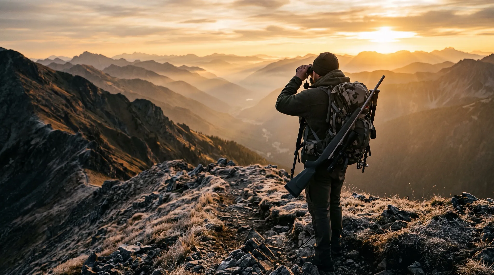
A hunter found you at 9 p.m. He’s got a tag burning a hole in his pocket and three outfitter tabs open. Your photos are good. But he can’t tell from your homepage whether you hunt the unit he drew, what a guided rifle hunt runs, or how many hunters you take a season. Thirty seconds later he’s on a competitor’s site that answers all three above the fold.
That’s not a design problem. That’s a structure problem. Most outfitter sites lose hunts not because they’re ugly, but because the right information isn’t in the right place — so the hunter never gets to the part where he books.
Why structure beats looks
I build sites for hunting outfitters, and the single biggest lever isn’t the hero shot — it’s the architecture. A hunter arrives with a short, specific list of questions, and your job is to answer them in the order he asks, with the fewest clicks possible.
Get the structure right and a stranger can go from “never heard of you” to “what dates do you have open” in under two minutes. Get it wrong and even a gorgeous site leaks bookings.
A hunter isn’t browsing for fun. He’s qualifying you against two other outfitters with his thumb. Structure decides whether he finds his answer on your site or theirs.
The website structure for hunting outfitters that actually books
Here’s the page-by-page layout I use. It maps to the order a hunter’s brain works through the decision.
- Home — Who you are, where you hunt, what you hunt, and one clear next step (“Check Availability” or “Plan Your Hunt”). The hunter should know in five seconds if he’s in the right place.
- Hunts / Species — A dedicated page (or one per species) for elk, mule deer, whitetail, antelope, bear — whatever you run. Each lays out the method (rifle, archery, muzzleloader), the terrain, the typical season dates, and what success looks like.
- Rates & What’s Included — The page hunters secretly want most and outfitters most often hide. Lodging, meals, field care, trophy fees, licenses, guide ratio. Put a real number on it.
- The Hunt Experience — Lodge, camp, a typical day, how hard the country is, what to expect physically. This is where you set honest expectations and weed out bad-fit clients before they book.
- About / Your Guides — Hunters book people. Your story, your guides, your tags-filled history. This is trust.
- Gallery — Real hunters, real animals, real country. Not stock. Dated and organized by species if you can.
- Book / Contact — One obvious, friction-free way to start the conversation, on every page.
If you only fix one thing this season, make it the rates page. Burying pricing doesn’t protect you — it just sends serious hunters to the outfitter who respects their time enough to post it.
Organize by what the hunter wants, not your org chart
A common mistake: structuring the site around how you think about your business (“Packages,” “Services,” “Info”) instead of how a hunter searches (“Elk Hunts,” “Mule Deer,” “Rates”). Name your pages and menu items after the words a hunter would actually type or say. It helps the human and it helps Google — the same clarity that converts is what search engines reward for outfitters.
Make every species page a landing page
Here’s a structural move most outfitters miss. A hunter who drew a specific unit or wants a specific animal isn’t looking for your homepage — he’s looking for that hunt. When each species or hunt type has its own real page, two things happen:
- The hunter lands exactly where his question gets answered, instead of digging through a menu.
- You can rank for “guided elk hunts [your area]” instead of competing on your business name alone — which is also the kind of clarity that helps you show up in local search.
Each of those pages should end the same way: a clear path to check dates or start a conversation. Which brings us to the part of the structure that does the actual booking.
The page no structure can replace
You can build the cleanest site in your region and still lose the hunt in the last ten feet — the moment a ready hunter wants to ask, “Do you have the second week of October open?” If that question lands in a contact form he won’t hear back from until you’re off the mountain, you’ve lost him to whoever answers first.
That’s the gap Spotter fills. It sits on every page of the structure above and answers seasons, rates, and availability in real time — then captures the hunter’s name and dates and drops the lead straight to your phone. So the hunter who shows up at 9 p.m. while you’re in elk camp still gets an answer, and you still get the booking. It’s the difference between a brochure and a front desk, and it’s why so many outfitters’ sites look fine but don’t convert.
Structure gets the hunter to the question. The front desk answers it when you can’t.
Build it in this order
If you’re starting from scratch or fixing a tired site, build in priority order: Home, then your top-earning species page, then Rates, then the experience and trust pages, then everything else. Don’t let “we’ll add pricing later” stall the launch — the pages that answer money and dates are the ones that book hunts. You can see how we approach outfitter builds and what finished sites look like if you want a reference.
A hunting outfitter website isn’t a digital brochure to admire. It’s a tool to move a stranger from curiosity to deposit. Structure it around his questions, in his order, and it’ll do that work while you’re in the field.
Want a second set of eyes on how your site’s laid out? Book a quick call and I’ll walk your structure page by page — or message the Spotter on this site to see exactly how it answers a hunter who’s ready to book.